Opinion Box | 2025
Optimizing Insight Team Processes with Agilize
Conducting large-scale market research comes with numerous challenges. For the team specialized in carrying out these studies, having a centralized environment to manage, organize, create projects, and track results over time is crucial. This ensures that every client receives valuable insights from each research project conducted by Opinion Box.
My role
Product Designer
Opinion Box | 2025
Optimizing Insight Team Processes with Agilize
Conducting large-scale market research comes with numerous challenges. For the team specialized in carrying out these studies, having a centralized environment to manage, organize, create projects, and track results over time is crucial. This ensures that every client receives valuable insights from each research project conducted by Opinion Box.
(01)
The problem
Collecting and organizing data is no simple task—especially with a high volume of projects and a respondent panel that numbers in the thousands. How might we, as the product team, identify and implement the necessary improvements to enhance the operational efficiency of the insights team in registering, tracking, and measuring their research projects?
(02)
Understanding the user
Since this product was intended for internal use, we organized a series of collaborative workshops with the insights team and stakeholders. These sessions included:
Ideation exercises to generate potential solutions
Voting rounds to prioritize the most relevant ideas
Hypothesis formulation to define what we wanted to test and validate
These meetings helped clarify the initial uncertainties uncovered during the immersion phase. As a result, we were able to define a clear direction for the first prototype and prioritize the key improvements to be addressed.
(03)
Design Solutions
[1] Ongoing Projects
Some screens will not be shown due to confidentiality.
We started by improving the board view on the “Ongoing Projects” tab.
Previously, editing a project required navigating deep into the settings—an unnecessarily long and complex process. We simplified this by adding inline edit buttons, allowing analysts to make updates directly.
A key enhancement was the implementation of a modal view for project editing. Now, clicking on a project card opens a Trello-style modal where all project information can be edited quickly and intuitively—eliminating the need for multiple steps.


We also introduced:
New project statuses and tooltips to guide users through each stage more effectively.
A required date update mechanism: every time a project is moved to a new status, the analyst must enter new expected completion dates. Research revealed that this feature was essential for proper project tracking and management.
New Filters Introduced:
Previously, filtering was limited to the primary analyst. We expanded this to include filters for:
Client
Primary analyst
Secondary analyst
Expected delivery dates

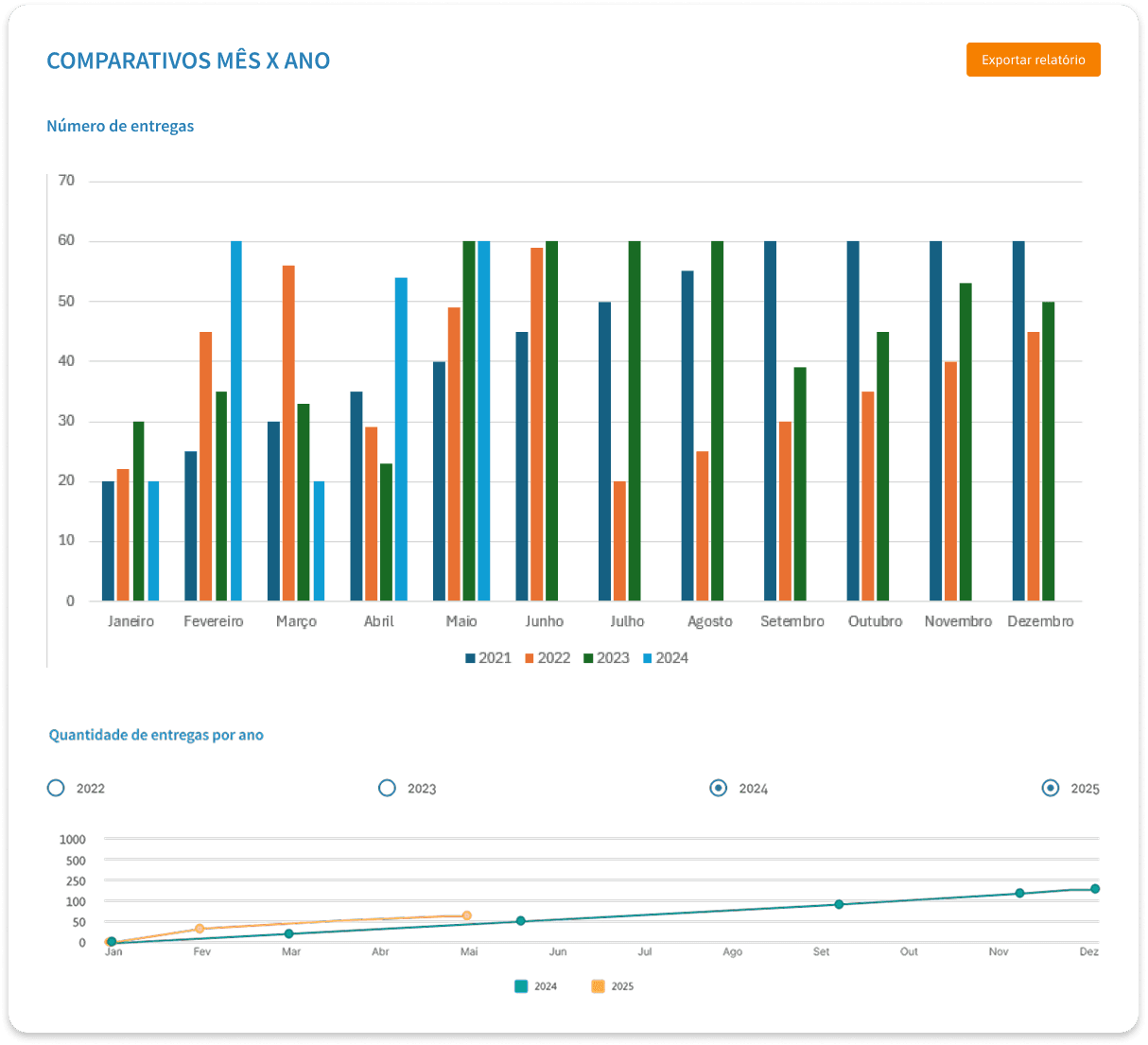
[2] Reports Screen
The reports screen was redesigned to provide a more logical and seamless data analysis experience.
The page starts with the Delivery Status section, which defaults to a date filter from 2022 to the present, summarizing the status of all tasks.
Next is the Total Delivered Projects section, featuring an independent status filter. This provides a clear breakdown of project outcomes.
Then comes the Month-over-Year Comparison section, which doesn’t rely on status filters but gives valuable insight into time-based trends.
Each section can be exported individually, using its current date filter. Alternatively, the entire report can be downloaded, applying the same date filter across all sections.


This project, aimed at optimizing the processes of the Insights team, is already in use by researchers—and the feedback has been overwhelmingly positive! The improved organization of projects, clearer timelines, and enhanced visualization brought a more intuitive and efficient user experience.
The redesigned reporting screens also empowered leadership with a macro view of project deliveries across weeks, months, and years—supporting better decision-making and offering valuable business insights.
(04)
What I learned
Improving user flows, journeys, and interactions is already rewarding—but doing it for your own team is even better.
This project gave me the chance to closely collaborate with and learn from the incredible research team at Opinion Box. Working alongside them and having the opportunity to improve their workflow was not only a learning experience—but truly an honor.
Let’s connect!
I hope you enjoyed my project! Feel free to contact me if you have any questions or if you'd like to work on your new project together!
My role
Product Designer
(01)
The problem
Collecting and organizing data is no simple task—especially with a high volume of projects and a respondent panel that numbers in the thousands. How might we, as the product team, identify and implement the necessary improvements to enhance the operational efficiency of the insights team in registering, tracking, and measuring their research projects?
(02)
Understanding the user
Since this product was intended for internal use, we organized a series of collaborative workshops with the insights team and stakeholders. These sessions included:
Ideation exercises to generate potential solutions
Voting rounds to prioritize the most relevant ideas
Hypothesis formulation to define what we wanted to test and validate
These meetings helped clarify the initial uncertainties uncovered during the immersion phase. As a result, we were able to define a clear direction for the first prototype and prioritize the key improvements to be addressed.
We also introduced:
New project statuses and tooltips to guide users through each stage more effectively.
A required date update mechanism: every time a project is moved to a new status, the analyst must enter new expected completion dates. Research revealed that this feature was essential for proper project tracking and management.
This project, aimed at optimizing the processes of the Insights team, is already in use by researchers—and the feedback has been overwhelmingly positive! The improved organization of projects, clearer timelines, and enhanced visualization brought a more intuitive and efficient user experience.
The redesigned reporting screens also empowered leadership with a macro view of project deliveries across weeks, months, and years—supporting better decision-making and offering valuable business insights.
[2] Reports Screen
The reports screen was redesigned to provide a more logical and seamless data analysis experience.
The page starts with the Delivery Status section, which defaults to a date filter from 2022 to the present, summarizing the status of all tasks.
Next is the Total Delivered Projects section, featuring an independent status filter. This provides a clear breakdown of project outcomes.
Then comes the Month-over-Year Comparison section, which doesn’t rely on status filters but gives valuable insight into time-based trends.
Each section can be exported individually, using its current date filter. Alternatively, the entire report can be downloaded, applying the same date filter across all sections.
New Filters Introduced:
Previously, filtering was limited to the primary analyst. We expanded this to include filters for:
Client
Primary analyst
Secondary analyst
Expected delivery dates
(03)
Design Solutions
[1] Ongoing Projects
Some screens will not be shown due to confidentiality.
We started by improving the board view on the “Ongoing Projects” tab.
Previously, editing a project required navigating deep into the settings—an unnecessarily long and complex process. We simplified this by adding inline edit buttons, allowing analysts to make updates directly.
A key enhancement was the implementation of a modal view for project editing. Now, clicking on a project card opens a Trello-style modal where all project information can be edited quickly and intuitively—eliminating the need for multiple steps.
(04)
What I learned
Improving user flows, journeys, and interactions is already rewarding—but doing it for your own team is even better.
This project gave me the chance to closely collaborate with and learn from the incredible research team at Opinion Box. Working alongside them and having the opportunity to improve their workflow was not only a learning experience—but truly an honor.
Let’s connect!
I hope you enjoyed my project! Feel free to contact me if you have any questions or if you'd like to work on your new project together!
Opinion Box | 2025
Optimizing Insight Team Processes with Agilize
Conducting large-scale market research comes with numerous challenges. For the team specialized in carrying out these studies, having a centralized environment to manage, organize, create projects, and track results over time is crucial. This ensures that every client receives valuable insights from each research project conducted by Opinion Box.
My role
Product Designer
(01)
The problem
Collecting and organizing data is no simple task—especially with a high volume of projects and a respondent panel that numbers in the thousands. How might we, as the product team, identify and implement the necessary improvements to enhance the operational efficiency of the insights team in registering, tracking, and measuring their research projects?
(02)
Understanding the user
Since this product was intended for internal use, we organized a series of collaborative workshops with the insights team and stakeholders. These sessions included:
Ideation exercises to generate potential solutions
Voting rounds to prioritize the most relevant ideas
Hypothesis formulation to define what we wanted to test and validate
These meetings helped clarify the initial uncertainties uncovered during the immersion phase. As a result, we were able to define a clear direction for the first prototype and prioritize the key improvements to be addressed.
(03)
Design Solutions
[1] Ongoing Projects
Some screens will not be shown due to confidentiality.
We started by improving the board view on the “Ongoing Projects” tab.
Previously, editing a project required navigating deep into the settings—an unnecessarily long and complex process. We simplified this by adding inline edit buttons, allowing analysts to make updates directly.
A key enhancement was the implementation of a modal view for project editing. Now, clicking on a project card opens a Trello-style modal where all project information can be edited quickly and intuitively—eliminating the need for multiple steps.
This project, aimed at optimizing the processes of the Insights team, is already in use by researchers—and the feedback has been overwhelmingly positive! The improved organization of projects, clearer timelines, and enhanced visualization brought a more intuitive and efficient user experience.
The redesigned reporting screens also empowered leadership with a macro view of project deliveries across weeks, months, and years—supporting better decision-making and offering valuable business insights.
(04)
What I learned
Improving user flows, journeys, and interactions is already rewarding—but doing it for your own team is even better.
This project gave me the chance to closely collaborate with and learn from the incredible research team at Opinion Box. Working alongside them and having the opportunity to improve their workflow was not only a learning experience—but truly an honor.
We also introduced:
New project statuses and tooltips to guide users through each stage more effectively.
A required date update mechanism: every time a project is moved to a new status, the analyst must enter new expected completion dates. Research revealed that this feature was essential for proper project tracking and management.
New Filters Introduced:
Previously, filtering was limited to the primary analyst. We expanded this to include filters for:
Client
Primary analyst
Secondary analyst
Expected delivery dates
[2] Reports Screen
The reports screen was redesigned to provide a more logical and seamless data analysis experience.
The page starts with the Delivery Status section, which defaults to a date filter from 2022 to the present, summarizing the status of all tasks.
Next is the Total Delivered Projects section, featuring an independent status filter. This provides a clear breakdown of project outcomes.
Then comes the Month-over-Year Comparison section, which doesn’t rely on status filters but gives valuable insight into time-based trends.
Each section can be exported individually, using its current date filter. Alternatively, the entire report can be downloaded, applying the same date filter across all sections.
Let’s connect!
I hope you enjoyed my project! Feel free to contact me if you have any questions or if you'd like to work on your new project together!