Heap Up | 2025
Rewards Expansion Project
At Heap Up, users can answer questions from various fields and earn rewards. Recently, I had the opportunity to work on a project to add new rewards to the platform's catalog, bringing exciting updates to our users. This initiative also allowed me to implement some refinements to enhance the overall platform experience.
My role
Product Designer | UX/UI
Methods
User Research / User Journey Mapping / Competitive Analysis / UX/UI Design / Visual Design / Prototyping / Testing
Heap Up | 2025
Rewards Expansion Project
At Heap Up, users can answer questions from various fields and earn rewards. Recently, I had the opportunity to work on a project to add new rewards to the platform's catalog, bringing exciting updates to our users. This initiative also allowed me to implement some refinements to enhance the overall platform experience.
(01)
Flow Analysis
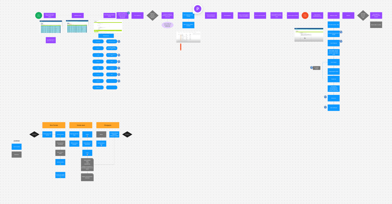
We began by thoroughly analyzing the current flow for selecting and redeeming rewards on both mobile and desktop platforms. This helped us identify pain points and areas for improvement.
(02)
Product Strategy
In the product strategy phase, our focus was on defining how new rewards would be integrated into both desktop and mobile platforms. We aimed to ensure the seamless placement of new rewards in the catalog while retiring outdated options. I conducted benchmarking research to understand how competitors handle reward systems and explored key attributes of our audience to align the updates with their expectations. This step was essential to make sure the new rewards felt relevant and valuable to users while meeting business objectives.
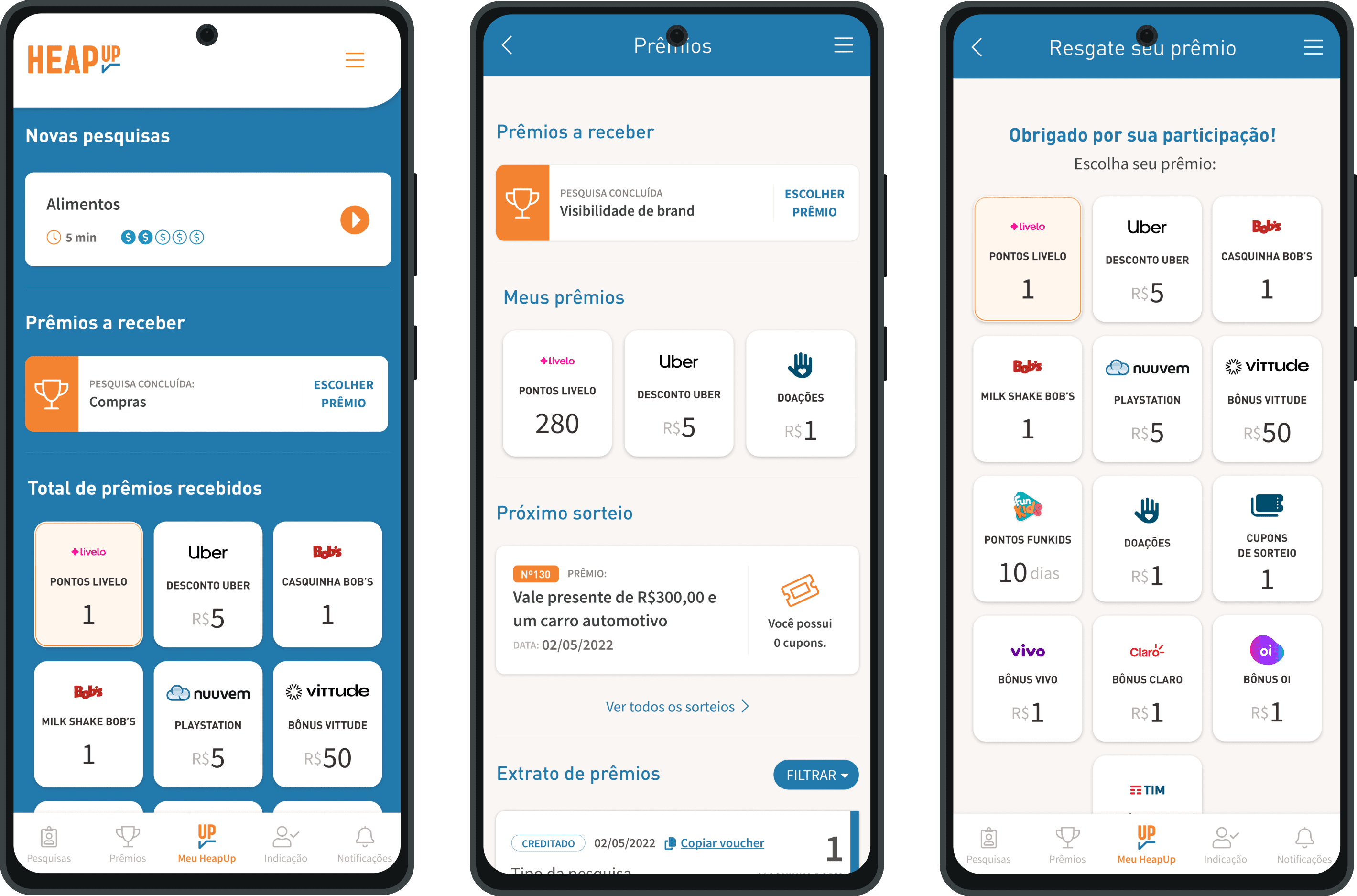
The changes were implemented across multiple screens. On the home screen, we reordered all rewards received by the user to highlight and give more value to those prizes. In the rewards screen, items are now listed based on the user's most frequently redeemed rewards, creating a more personalized experience. Additionally, in the reward statement screen, users can now copy their redeemed voucher code with a single click, improving usability and convenience.
(03)
User Experience
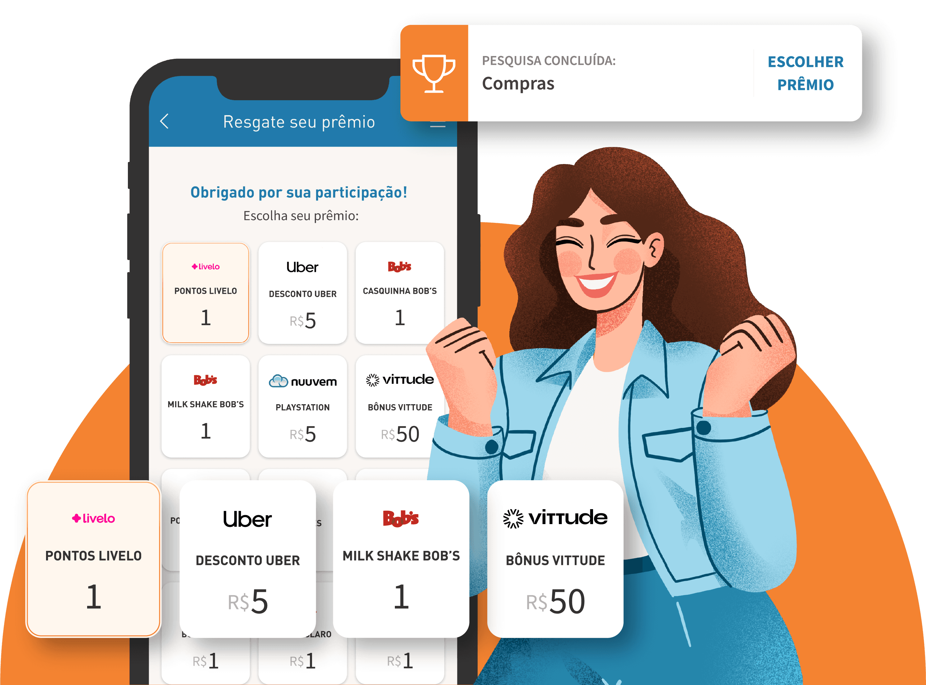
Based on the findings from earlier phases, I created designs that emphasized simplicity and ease of use. For the new rewards, I reimagined layouts for both desktop and mobile platforms, ensuring the catalog felt fresh and intuitive. I also redesigned modals for redeeming rewards, making them more engaging and straightforward.


(04)
Accessibility considerations
We implemented colors with good contrast and fonts that ensure text readability on any device, regardless of size.
(05)
What I learned
Working on a product with a user base as large as Heap Up's requires extensive research and dedication. Collaboration within the team was crucial to maintaining consistency across all details.
Let’s connect!
I hope you enjoyed my project! Feel free to contact me if you have any questions or if you'd like to work on your new project together!
My role
Product Designer | UX/UI
Methods
User Research / User Journey Mapping / Competitive Analysis / UX/UI Design / Visual Design / Prototyping / Testing
(01)
Flow Analysis
We began by thoroughly analyzing the current flow for selecting and redeeming rewards on both mobile and desktop platforms. This helped us identify pain points and areas for improvement.
(02)
Product Strategy
In the product strategy phase, our focus was on defining how new rewards would be integrated into both desktop and mobile platforms. We aimed to ensure the seamless placement of new rewards in the catalog while retiring outdated options. I conducted benchmarking research to understand how competitors handle reward systems and explored key attributes of our audience to align the updates with their expectations. This step was essential to make sure the new rewards felt relevant and valuable to users while meeting business objectives.
(03)
User Experience
Based on the findings from earlier phases, I created designs that emphasized simplicity and ease of use. For the new rewards, I reimagined layouts for both desktop and mobile platforms, ensuring the catalog felt fresh and intuitive. I also redesigned modals for redeeming rewards, making them more engaging and straightforward.
The changes were implemented across multiple screens. On the home screen, we reordered all rewards received by the user to highlight and give more value to those prizes. In the rewards screen, items are now listed based on the user's most frequently redeemed rewards, creating a more personalized experience. Additionally, in the reward statement screen, users can now copy their redeemed voucher code with a single click, improving usability and convenience.
(04)
Accessibility considerations
We implemented colors with good contrast and fonts that ensure text readability on any device, regardless of size.
(05)
What I learned
Working on a product with a user base as large as Heap Up's requires extensive research and dedication. Collaboration within the team was crucial to maintaining consistency across all details.
Let’s connect!
I hope you enjoyed my project! Feel free to contact me if you have any questions or if you'd like to work on your new project together!
Heap Up | 2025
Rewards Expansion Project
At Heap Up, users can answer questions from various fields and earn rewards. Recently, I had the opportunity to work on a project to add new rewards to the platform's catalog, bringing exciting updates to our users. This initiative also allowed me to implement some refinements to enhance the overall platform experience.
My role
Product Designer | UX/UI
Methods
User Research / User Journey Mapping / Competitive Analysis / UX/UI Design / Visual Design / Prototyping / Testing
(01)
Flow Analysis
We began by thoroughly analyzing the current flow for selecting and redeeming rewards on both mobile and desktop platforms. This helped us identify pain points and areas for improvement.
(02)
Product Strategy
In the product strategy phase, our focus was on defining how new rewards would be integrated into both desktop and mobile platforms. We aimed to ensure the seamless placement of new rewards in the catalog while retiring outdated options. I conducted benchmarking research to understand how competitors handle reward systems and explored key attributes of our audience to align the updates with their expectations. This step was essential to make sure the new rewards felt relevant and valuable to users while meeting business objectives.
(03)
User Experience
Based on the findings from earlier phases, I created designs that emphasized simplicity and ease of use. For the new rewards, I reimagined layouts for both desktop and mobile platforms, ensuring the catalog felt fresh and intuitive. I also redesigned modals for redeeming rewards, making them more engaging and straightforward.
(04)
Accessibility considerations
We implemented colors with good contrast and fonts that ensure text readability on any device, regardless of size.
(04)
What I learned
Working on a product with a user base as large as Heap Up's requires extensive research and dedication. Collaboration within the team was crucial to maintaining consistency across all details.
The changes were implemented across multiple screens. On the home screen, we reordered all rewards received by the user to highlight and give more value to those prizes. In the rewards screen, items are now listed based on the user's most frequently redeemed rewards, creating a more personalized experience. Additionally, in the reward statement screen, users can now copy their redeemed voucher code with a single click, improving usability and convenience.
Let’s connect!
I hope you enjoyed my project! Feel free to contact me if you have any questions or if you'd like to work on your new project together!